Category: Web Development

  • Learn What Is Bootstrap in Web Development in Minutes 

    Learn What Is Bootstrap in Web Development in Minutes 

    Building a website can feel like arranging hundreds of tiny pieces. Learning what is bootstrap in web development makes that process easier because Bootstrap provides a ready-made foundation for creating clean, responsive websites without styling every element from zero.

    Bootstrap is a free, open-source front-end framework built with HTML, CSS, and JavaScript. It helps developers create mobile-first websites faster through reusable layouts, utility classes, interface components, and interactive plugins.

    Key Takeaways

    • Bootstrap is a front-end framework.
    • It supports responsive design. 
    • It includes a 12-column grid. 
    • It provides reusable UI components. 
    • It reduces repetitive coding while allowing custom styles.

    Core Bootstrap Components

    Bootstrap combines several tools that create structured, responsive, and consistent web pages.

    The Grid System

    The Bootstrap grid uses 12 flexible columns. Developers place content inside containers, rows, and columns, then control how much space each section occupies.

    Responsive breakpoint classes tell the browser when the layout should change, making mobile-first development easier.

    Pre-Styled UI Components

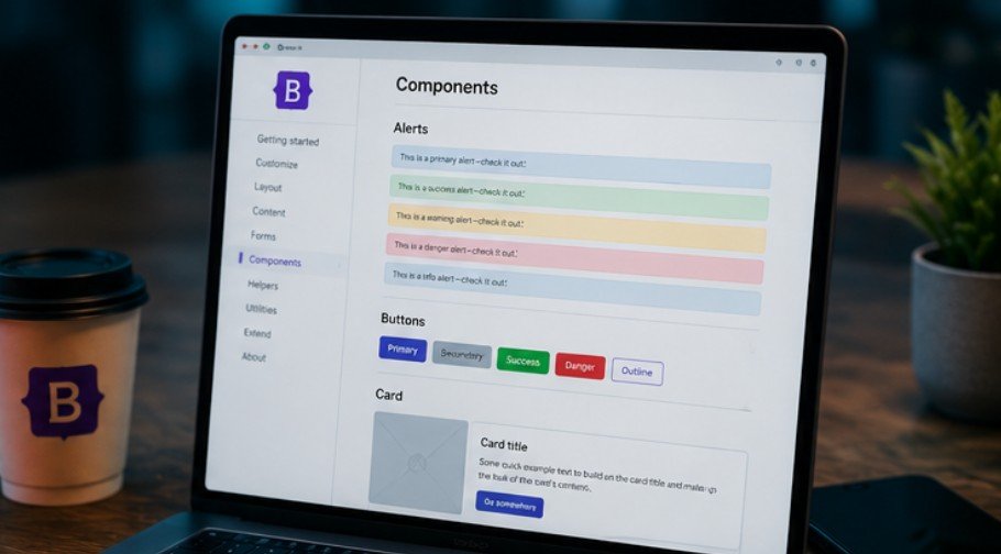
    Bootstrap includes buttons, forms, cards, alerts, navigation bars, dropdowns, tables, and pagination controls. These components already contain spacing, colors, borders, and responsive behavior.

    Developers can keep the defaults or customize them with CSS, Sass variables, and utility classes. This creates a consistent starting point without forcing every site to look identical.

    JavaScript Plugins

    Optional JavaScript plugins add modals, carousels, collapsible menus, dropdowns, tooltips, off-canvas panels, and accordions. Bootstrap 5 uses standard JavaScript and does not require jQuery.

    How Bootstrap Works
    How Bootstrap Works

    Understanding what is bootstrap in web development becomes practical once you see how the framework connects to an ordinary HTML page.

    Connect the Framework

    Start with a standard HTML5 document and include the viewport meta tag so responsive layouts scale correctly on phones and tablets.

    Next, connect Bootstrap through a content delivery network, download its files, or install it with npm. The CSS controls styling, while JavaScript powers interactive components.

    Add Bootstrap Classes

    Bootstrap works by adding predefined classes to HTML elements. A normal button becomes a polished primary button by adding the classes btn and btn-primary.

    Layout classes work similarly. A developer can create a container, add a row, and insert responsive columns without writing complex width calculations.

    Test and Customize

    Test the page at several screen sizes. Check whether columns stack correctly, menus open smoothly, text remains readable, and forms work with a keyboard.

    Then customize colors, typography, spacing, borders, and component states. A strong Bootstrap website should reflect its brand instead of resembling an unchanged template.

    Key Benefits of Bootstrap

    Key Benefits of Bootstrap

    Bootstrap remains popular because it solves common front-end problems with reusable tools.

    Faster Development

    Prebuilt components reduce the time needed to create interface elements. Developers can assemble landing pages, dashboards, forms, and navigation systems without rebuilding each feature.

    Better Device Consistency

    Bootstrap uses responsive breakpoints to help content adapt across phones, tablets, laptops, and desktop monitors. Its tested styles also reduce browser inconsistencies.

    Easy Learning and Customization

    Beginners with basic HTML and CSS knowledge can understand Bootstrap classes quickly. Advanced developers can change Sass variables, use CSS custom properties, import selected modules, or override component styles.

    Real-World Bootstrap Uses

    Bootstrap appears in practical projects because it balances speed, structure, and flexibility.

    Business Sites and Landing Pages

    A business site may need a responsive header, service cards, pricing sections, contact forms, and a footer. Bootstrap provides foundations for each element.

    Navigation can be improved further by learning how to make sticky header CSS, which keeps important menu links visible as visitors scroll through longer landing pages.

    This approach works well alongside Bootstrap navigation components when developers want persistent access to key sections without relying on additional plugins.

    Dashboards and Admin Panels

    Dashboards often contain tables, filters, alerts, forms, cards, and side navigation. Bootstrap keeps these elements visually consistent and easy to arrange.

    Teams can focus on data, permissions, and application logic instead of repeatedly styling basic components.

    Prototypes and Learning Projects

    Bootstrap helps teams test ideas before investing in a custom design system. They can build a working prototype, collect feedback, and improve it before production.

    Students can use it to understand responsive grids, spacing, components, and mobile-first design after learning HTML and CSS basics.

    Limits to Consider

    Bootstrap is useful, but using it without planning can create problems.

    Extra Code

    Loading the complete framework may include styles and scripts a small site never uses. Unnecessary code can increase page weight.

    Use minified production files, avoid unused JavaScript, and import selected Sass modules when performance matters.

    Familiar-Looking Designs

    Sites may look generic when developers use default components without customization. The same buttons and cards can appear across unrelated projects.

    Changing typography, colors, spacing, borders, and component details creates a stronger identity.

    Class-Heavy Markup

    Bootstrap may require several classes on one HTML element. Large class combinations can make markup harder to scan.

    Bootstrap Versus Other Tools

    Bootstrap Versus Other Tools

    Comparing Bootstrap with other technologies clarifies its role.

    Bootstrap Versus CSS

    CSS is the language browsers use to style HTML. Bootstrap is a toolkit built mainly with CSS and JavaScript that provides ready-made rules and components. A website can use plain CSS without Bootstrap.

    Bootstrap Versus Tailwind CSS

    Bootstrap provides finished components with an established style. Tailwind CSS focuses on utility classes developers combine for custom interfaces.

    Bootstrap suits teams wanting ready-made components. Tailwind may suit projects requiring a highly specific design system.

    Accessibility and Performance

    Responsive design is not automatically accessible or fast. Developers remain responsible for the finished experience.

    Support Every Visitor

    Use semantic HTML, clear form labels, visible focus indicators, descriptive buttons, and logical heading order. Test interactive components with a keyboard and screen reader.

    Developers should also understand how to test website accessibility across different devices and assistive technologies. Regular testing can uncover problems with keyboard navigation, color contrast, form labels, focus states, and interactive Bootstrap components before they affect real users.

    Bootstrap offers helpful patterns, but developers must apply accessibility guidance correctly.

    Keep Pages Lean

    Load only the styles and scripts the project needs. Compress images, use minified assets, and test Core Web Vitals after implementation. Performance decisions should be based on measurements rather than assumptions.

    Frequently Asked Questions

    1. What Is the Use of Bootstrap in Web Development?

    Bootstrap helps developers create responsive layouts, forms, navigation bars, buttons, cards, and interactive elements faster through reusable CSS classes and JavaScript components.

    2. What Is Bootstrap Versus CSS?

    CSS is a styling language, while Bootstrap is a framework built with CSS and JavaScript. Bootstrap supplies predefined layouts, utilities, and components that reduce repetitive styling.

    3. Is Bootstrap Backend or Frontend?

    Bootstrap is a front-end framework. It controls a website’s visible design and interaction, not databases, server logic, authentication systems, or backend processing.

    4. Is Bootstrap Used Anymore?

    Yes, Bootstrap is still used for dashboards, business websites, prototypes, internal tools, and responsive interfaces where fast development and consistent components matter.

    Bootstrap Still Packs a Punch

    Knowing what is bootstrap in web development helps explain how responsive websites can be built faster without sacrificing structure. Bootstrap offers a flexible grid, reusable components, utility classes, and interactive plugins. It works best when developers customize the design, remove unnecessary code, test accessibility, and choose it because it genuinely suits the project.

  • How to Add JavaScript to HTML for Better Web Performance

    How to Add JavaScript to HTML for Better Web Performance

    Building web pages brings so much excitement until our static site needs interactive buttons, dynamic forms, or live updates. Learning how to add JavaScript to HTML is the exact moment our static page transforms into a living web application. We have all struggled through broken scripts and blank screens early in our web development journey, so let us break down this process together cleanly and simply.

    Key Takeaways

    • Connecting JavaScript to HTML requires choosing the right embedding strategy for your project goals.
    • External scripts keep our code clean, maintainable, and easy to cache across multiple web pages.
    • Using defer prevents render-blocking bugs and ensures elements load before your script executes.
    • Modern ES6 modules simplify component building by supporting native import and export statements.
    • Browser Developer Tools give us instant diagnostic feedback whenever scripts fail to load properly.

    Understanding the Role of Script Tags

    Every browser relies on specific markup elements to interpret programming logic alongside structural tags.

    We rely on the HTML script tag to tell web browsers where executable programming logic lives inside our web document structure. This tag acts as a universal bridge, allowing client-side scripts to manipulate elements, listen for user mouse clicks, and send background network requests seamlessly.

    When web browsers scan our HTML files from top to bottom, encountering a script tag pauses document parsing until that script finishes loading. Understanding this sequence helps us write cleaner code while avoiding page speed penalties that hurt user experience and search engine rankings.

    Using Internal JavaScript Inside Your Markup

    Writing code directly within HTML files works well for quick experiments and small single-page projects.

    Internal JavaScript places raw programming code directly between an opening and closing script tag inside our main HTML file. We can place this block inside either the head or body sections depending on when we want the logic to execute during document parsing.

    This method shines when prototyping quick ideas because everything remains contained in a single document. However, mixing logic with markup makes larger projects difficult to maintain and prevents web browsers from caching our code for faster repeat page visits.

    Linking External JavaScript Files for Clean Code

    Linking External JavaScript Files for Clean Code

    Separating programming logic from document layout remains the primary industry standard across modern software development.

    Linking external scripts involves creating a standalone file with a .js extension and referencing it inside our HTML using the src attribute. This clean approach ensures our HTML stays readable while allowing multiple web pages to share the exact same script file effortlessly.

    Browser caching takes full advantage of external files by storing them locally after the first visit. This significantly speeds up load times across our entire website while keeping our source code organized into modular, reusable components according to official web standards.

    Modern Techniques Competitors Miss: Async, Defer, and ES6 Modules

    Optimizing script loading sequence prevents frustrating blank screens and delivers blazing fast page speeds.

    Stopping Render-Blocking with Defer and Async

    Choosing the correct loading attribute dramatically improves real-world loading speed and core web vitals.

    The defer attribute tells the browser to download our script in the background while continuing to render HTML elements. The script only executes after the browser finishes parsing the complete document, making it ideal for scripts that depend on existing DOM elements.

    The async attribute downloads the script in the background but executes it immediately upon arrival, pausing HTML parsing briefly. This attribute works best for independent third-party scripts like Google Analytics or advertisement trackers where element manipulation order does not matter.

    Embracing Modern JavaScript with ES6 Modules

    Embracing Modern JavaScript with ES6 Modules

    Modular architecture allows developers to structure complex applications into clean, independent code chunks.

    Adding type=”module” to our script tag enables modern ES6 module imports and exports directly inside the browser. Modules automatically run in strict mode, scoped locally to prevent global variable pollution across our codebase.

    Modern modules automatically enforce deferred execution behavior without requiring additional attributes. This modern approach allows us to import helper functions across multiple JavaScript files cleanly without polluting global memory.

    As projects grow beyond basic JavaScript, developers may also explore typescript union and intersection types to describe flexible data structures while keeping reusable modules more predictable. These type features are especially useful when functions or components need to accept multiple related data shapes without sacrificing code clarity.

    Handling DOM Events with DOMContentLoaded

    Executing code before elements exist on the page causes classic null target errors for beginner developers.

    Wrapping script execution inside a DOMContentLoaded event listener guarantees that our HTML document structure fully loads before running interactive logic. This safeguards our scripts against missing element reference errors when scripts are placed in the head tag without defer.

    We can attach event listeners directly to the window object to manage setup routines smoothly. This practice builds bulletproof interactive features regardless of where our team decides to place script tags across different site templates.

    Step-by-Step Guide on How to Add JavaScript to HTML

    Implementing interactive features step-by-step builds solid practical muscle memory for beginner web developers.

    First, create a separate file named script.js for your code. Then link it in your HTML using the src attribute inside the script tag. Place this tag right before the closing </body> tag so it does not slow down your website rendering.

    HTML

    <!DOCTYPE html>

    <html>

    <head>

        <title>My Webpage</title>

    </head>

    <body>

        <h1>Hello World</h1>

        <!– Link your external JS file here –>

        <script src=”script.js”></script>

    </body>

    </html>

    Second, if you only have a few lines of code, write them directly between the opening <script> and closing </script> tags inside your body element.

    HTML

    <body>

        <h1>Hello World</h1>

        <script>

            console.log(“This runs directly in the HTML!”);

        </script>

    </body>

    Third, if you prefer to place your external script tags inside the <head> section, always add the defer attribute. This tells the browser to download the script in the background and run it after the layout finishes loading.

    HTML

    <head>

        <!– Safely loads from the head without blocking the page –>

        <script src=”script.js” defer></script>

    </head>

    Summary of Best Practices: Keep HTML and JavaScript in separate files to stay organized. Load scripts at the end of the body or use defer to make your site load faster. Use async instead of defer only if the script is completely independent like third-party analytics.

    Debugging and Best Practices for JavaScript Integration

    Debugging and Best Practices for JavaScript Integration

    Following established industry guidelines saves hours of troubleshooting broken scripts and non-responsive page elements.

    Troubleshooting Common Browser Console Errors

    Browser console diagnostic tools help us pinpoint syntax bugs and path typos instantly.

    A 404 error in the browser console usually means our script file path inside the src attribute is incorrect. Double-checking directory folder structures and file spelling fixes the majority of missing script connection issues immediately.

    Uncaught ReferenceError message indicates our code tried to select an HTML element before the browser created it. Adding the defer attribute or moving script tags just before the closing body tag resolves DOM loading race conditions.

    Essential Best Practices for Clean Web Architecture

    Adhering to clean coding standards keeps web applications fast, accessible, and easily maintainable.

    Keep script files small and modular by splitting unrelated logic into separate external files. Single responsibility files simplify team collaboration, unit testing, and long-term project maintenance across large engineering teams.

    Developers working with front-end frameworks should also understand what is bootstrap in web development and how its JavaScript components integrate with HTML. Knowing how framework scripts are loaded helps prevent broken dropdowns, modals, navigation menus, and other interactive components while keeping the project structure organized.

    Avoid legacy inline event handlers like onclick directly inside HTML tags because they clutter markup files. Modern web architecture emphasizes separation of concerns by binding event listeners exclusively inside external JavaScript files.

    Frequently Asked Questions

    1. How to add JavaScript in HTML code?

    To add JavaScript in HTML code, insert the script tag inside your file. You can either write your code directly between the opening and closing script tags or reference an external file using the src attribute for better project structure.

    2. How do I import JavaScript code into HTML?

    You import JavaScript code into HTML by using the script tag with a src attribute pointing to your JS file path. Adding the defer attribute inside the script tag ensures your HTML content loads completely before running external code.

    3. How can I enable JavaScript in HTML?

    JavaScript runs automatically inside web browsers without needing extra configuration. To ensure your code executes in your HTML file, verify that script tags use valid syntax, reference correct relative file paths, and contain no script blocking syntax errors.

    4. How to display JavaScript in HTML?

    Display JavaScript output in HTML by targeting specific elements using document.getElementById() or document.querySelector(). Once targeted, update the element’s textContent or innerHTML properties to render dynamic data, calculation results, or interactive text directly on screen.

    Time to Bring Your Static Web Pages to Life!

    Mastering how to add JavaScript to HTML is your ultimate stepping stone toward becoming a full-stack developer. By keeping script files separate, leveraging the defer attribute, and writing modular functions, you will build faster and cleaner web applications. Go ahead and start linking your scripts today to deliver interactive experiences your visitors will truly love!

  • How to Test Website Speed: The Ultimate Web Developer Guide

    How to Test Website Speed: The Ultimate Web Developer Guide

    Testing site performance used to feel like rocket science, but learning how to test website speed is actually straightforward once you know where to look. Website performance forms the foundation of every successful online project in modern web development.

    Key Takeaways

    • Site speed impacts search engine rankings, bounce rates, and user conversion metrics directly.
    • Core Web Vitals like LCP, INP, and CLS define modern web performance standards.
    • Test from multiple server locations and mobile network configurations for true accuracy.
    • Waterfall charts reveal major bottlenecks like render-blocking scripts and server delay.
    • Regular testing helps catch performance regressions before they hurt overall business results.

    Why Fast Loading Speeds Keep Digital Products Alive

    User Retention and Engagement

    Visitors expect web pages to load almost instantly on any modern mobile device. When a page takes more than three seconds to load, over half of your visitors will leave before seeing your content. Fast-loading sites keep users engaged, reduce bounce rates, and build trust from the very first click.

    Search Engine Optimization Impact

    Google considers page speed a direct ranking factor for both desktop and mobile search results. Search engines prioritize websites that deliver fast, seamless user experiences over sluggish competitors. Measuring performance regularly ensures your technical SEO foundation remains strong and competitive.

    Conversion Rates and Revenue Growth

    Every second of delay directly reduces your conversion rates and hurts your overall revenue numbers. E-commerce platforms and business sites lose money every year due to slow checkout processes and laggy interfaces. Speed optimization directly drives business growth by making user actions totally effortless.

    Essential Metrics Every Developer Must Track

    Essential Metrics Every Developer Must Track

    Understanding performance metrics helps you diagnose exact technical issues rather than guessing blindly.

    Decoding Core Web Vitals

    Google uses three main metrics called Core Web Vitals to measure real-world user experience accurately. Largest Contentful Paint measures how long it takes for the main content to render on screen. Interaction to Next Paint tracks overall responsiveness, while Cumulative Layout Shift evaluates visual page stability.

    Lab Data Versus Field Data

    Lab data comes from controlled environments designed to simulate specific devices and network speeds. Field data captures real performance from actual human visitors navigating your site over time. Combining both data types gives you a complete picture of your site health.

    Understanding Server Response Time

    Time to First Byte measures how quickly a web server responds to an incoming user request. A slow response time usually indicates poor web hosting, unoptimized database queries, or missing server-side caching. Fixing server delays improves every downstream metric across your entire website.

    How to Test Website Speed with Top Diagnostics

    How to Test Website Speed with Top Diagnostics

    Selecting the right diagnostic tools makes performance testing fast, accurate, and actionable for developers.

    Google PageSpeed Insights

    Google PageSpeed Insights provides immediate access to both real-world field data and controlled lab tests. It yields an overall performance score alongside clear, prioritized suggestions for speed improvement. Developers rely on this free tool because it aligns directly with search ranking criteria.

    GTmetrix and Waterfall Analysis

    GTmetrix combines performance testing with detailed waterfall charts to display every loading file cleanly. You can test from various global test locations to simulate global user bases accurately. Analyzing request timelines helps isolate oversized image assets, third-party scripts, and slow network calls.

    Pingdom for Simple Regional Tests

    Pingdom is a fantastic option when you need quick, straightforward performance reports without unnecessary complexity. It tests page load times, total page weight, and HTTP requests from multiple regions worldwide. The platform assigns clean letter grades, making rapid post-deployment checks easy for engineers.

    How to Test Website Speed: Step by Step

    Running speed tests correctly requires a clear systematic methodology to capture actionable data every time.

    You can check your website speed using free online tools such as Google PageSpeed Insights, GTmetrix, or Pingdom. Simply go to one of these websites, type or paste your page link into the search box, and click the analyze or start button to see your performance report. Run tests multiple times throughout the day to account for temporary server load variations.

    Examine the request breakdown to identify large media assets, render-blocking scripts, or slow database responses. Compare your mobile performance results against desktop figures, taking note of specific metric failures like high LCP or poor INP scores. Document your baseline numbers before making code modifications so you can measure optimization gains over time.

    For official technical documentation on performance standards, consult web.dev Performance Guidelines and review developer notes on Google Search Central.

    Fixing Common Bottlenecks to Turbocharge Load Times

    Fixing Common Bottlenecks to Turbocharge Load Times

    Most slow websites suffer from a few predictable technical issues that are straightforward to resolve.

    Optimizing Oversized Media Assets

    Uncompressed images and raw video files represent the single largest cause of page bloat today. Switching to modern image formats like WebP or AVIF drastically reduces payload sizes without losing quality. Implementing responsive images ensures mobile users download smaller versions tailored to their screen resolution.

    Managing Render Blocking Resources

    JavaScript files and external CSS stylesheets often pause page rendering while downloading in the browser background. Deferring non-essential scripts and inlining critical CSS allows the main page structure to display immediately. This approach improves perceived performance and lowers Largest Contentful Paint times significantly.

    JavaScript performance also depends on how efficiently user interactions are handled after the page loads. Understanding what is event bubbling JavaScript can help developers reduce unnecessary event listeners through delegation, simplify interaction logic, and improve responsiveness across complex interfaces with many clickable elements.

    Implementing Caching and CDNs

    Browser caching stores static assets locally on user devices so returning visitors load pages instantly. Content Delivery Networks distribute your site assets across global servers, serving files from nodes closest to each user. Combining proper caching policies with a robust CDN drastically minimizes latency worldwide.

    Performance tuning should also account for response configuration at the server level. Reviewing the best HTTP security headers for websites helps developers strengthen browser protections while ensuring headers, caching rules, and delivery settings are configured carefully without creating unnecessary conflicts or resource-loading problems.

    Frequently Asked Questions

    1. How to test website speed accurately across devices?

    To learn how to test website speed across devices, run Google PageSpeed Insights or GTmetrix, selecting specific mobile and desktop profiles to compare lab and field metrics across different screen sizes and CPU throttle levels.

    2. What is a good overall website performance score?

    Aim for a performance score of 90 or higher on Google PageSpeed Insights, with sub-2.5-second Largest Contentful Paint load times and an Interaction to Next Paint under 200 milliseconds on mobile networks.

    3. Why does my site speed score fluctuate between tests?

    Scores vary due to fluctuating network traffic, third-party script delays, server responsiveness changes, and dynamic advertising scripts loading asynchronously during testing runs.

    4. Does web hosting affect my page loading speed?

    Yes, your web hosting provider directly impacts server response time, database speed, hardware capabilities, and resource allocation under heavy user traffic conditions.

    Speed Up or Get Left Behind in the SERPs

    Mastering how to test website speed empowers you to deliver exceptional digital experiences while boosting your organic search visibility. Regular diagnostic testing catches technical performance issues early, ensuring your web applications stay fast, lean, and user-friendly. Start auditing your pages today to optimize your load times and keep your users happy!

  • Write Clean Codes Knowing What Is Event Bubbling JavaScript

    Write Clean Codes Knowing What Is Event Bubbling JavaScript

    Building interactive web apps often leads us to weird bugs where clicking one button triggers three actions at once. Learning what is event bubbling JavaScript helps us master how user clicks travel through our HTML elements seamlessly.

    Understanding what is event bubbling JavaScript keeps you sane when building complex user interfaces. Without this knowledge, your page clicks trigger chaotic chain reactions, modal popups close unexpectedly, and navigation menus break. Master this concept to tame event chaos easily.

    Key Takeaways for Web Developers

    • Events bubble upward from the clicked child element all the way up to the root document node in the HTML DOM tree.
    • Browsers turn on event bubbling by default whenever we register standard event listeners on page elements.
    • Event delegation leverages bubbling so a single parent container can manage interactions for dozens of dynamic child elements.
    • Calling stopPropagation halts upward event travel but we should use it carefully to prevent breaking outer global listeners.
    • Mastering event bubbling improves app performance, lowers memory consumption, and keeps our code clean.

    How Events Travel Up the DOM Tree

    Understanding how browser events travel through nested DOM structures is essential for writing clean event handlers.

    The Journey from Target to Root

    Every time a user clicks a button inside a nested div, the browser triggers an event on that specific element. Instead of stopping right there, the event bounces up to the parent element, then to the parent’s parent, and continues climbing up to the document object. 

    Think of it like dropping a pebble into a small bucket inside a larger tub; the initial splash spreads outward to affect every outer layer.

    Why Web Browsers Work This Way

    Engineers who built early web browsers needed a way for parent elements to know when something inside them changed. By letting events flow upward, outer elements can naturally respond to user inputs without requiring us to attach listeners to every single child tag. 

    You can explore the official MDN Web Docs on Event Propagation to read how browser standards evolved over time.

    The Difference Between Target and Current Target

    JavaScript provides two distinct properties inside the event object that help us track this movement. The event.target property points directly to the exact element that received the initial click, such as a child span tag. Meanwhile, event.currentTarget refers to the element currently handling the event as it bubbles upward through the tree.

    Comparing Event Propagation Phases

    Comparing Event Propagation Phases

    Browser event propagation happens in distinct stages that dictate when individual event listeners execute.

    The Downward Capturing Phase

    Before an event bubbles up, it actually travels down from the top document root down to the target element. This initial downward trip is called the capturing or trickling phase. Most web developers rarely interact with this phase, but it allows outer elements to intercept user actions before they reach the inner target.

    The Upward Event Bubbling Phase

    Once the event hits the deepest target element, it enters the official bubbling phase. During this stage, event listeners attached to parent containers execute in sequential order from inside out. To read more about how standard specs define this flow, visit the W3C DOM Event Specification page.

    Choosing Between Capturing and Bubbling

    We can choose which phase to listen to when adding event listeners using addEventListener in JavaScript. Passing true as the third argument listens during capturing, while leaving it empty or passing false defaults to bubbling. Almost all modern frontend applications rely almost exclusively on the default bubbling phase.

    Step-by-Step Guide to Event Bubbling JavaScript

    Step-by-Step Guide to Event Bubbling JavaScript

    Implementing what is event bubbling JavaScript in production apps helps streamline code and boosts site rendering performance.

    Set Up a Parent Delegate

    First, we attach a single click listener to an overarching parent element like an unordered list container rather than attaching individual listeners to hundreds of list items. This keeps our memory footprint small and makes DOM updates significantly faster.

    Inspect the Clicked Target

    Next, inside our event listener callback function, we inspect event.target to see which specific child element triggered the user interaction. We can check class names, attributes, or tag names to verify if the clicked node is the exact button or link we care about.

    Execute Specific Actions Safely

    Finally, we run our business logic based on that target check while allowing unrelated clicks on the parent background to pass by harmlessly. Check out JavaScript.info’s Event Delegation Guide for deeper real-world code examples using this pattern.

    Mastering Event Delegation and Performance

    Mastering Event Delegation and Performance

    Leveraging event delegation unlocks massive performance gains when managing dynamic DOM nodes.

    Boosting Memory Efficiency

    Creating thousands of event listeners inside a complex web application development consumes memory and can slow down lower-end mobile devices. By using event bubbling to consolidate listeners onto a shared parent, we reduce garbage collection overhead and keep our applications snappy.

    Performance also depends on where and how application content is rendered. Understanding client side versus server side rendering helps developers decide whether interactive JavaScript should handle most page updates in the browser or whether initial content should be generated on the server for faster delivery and improved efficiency.

    Handling Dynamically Added UI Elements

    When we add new items to a dynamic todo list or endless feed, traditional listeners require us to bind new event handlers manually. Event bubbling solves this automatically because new child items seamlessly bubble their events up to the existing parent listener without extra code.

    Avoiding Overuse of Stop Propagation

    Calling event.stopPropagation() stops the event from reaching parent containers, which can fix local UI issues like unwanted modal closes. However, overusing it breaks global analytics tracking, dropdown auto-closing scripts, and top-level navigation listeners that rely on observing every page click.

    This kind of ripple effect is one reason why developers are learning systems thinking instead of more frameworks. Rather than treating each event handler as an isolated piece of code, developers can examine how local changes influence analytics, navigation, shared components, and other connected parts of the application.

    Frequently Asked Questions

    1. How can I stop event bubbling in JavaScript?

    You can stop event bubbling by calling the event.stopPropagation() method inside your event handler function. This immediately halts the event journey and prevents parent DOM elements from detecting or reacting to that click action.

    2. What is the difference between event bubbling and event capturing in JavaScript?

    Event capturing moves downward from the root document object all the way to the target element. Event bubbling travels in the opposite direction, moving upward from the clicked target element back up through ancestors to the root.

    3. Is event bubbling default?

    Yes, event bubbling is the default behavior in modern web browsers. Standard addEventListener calls automatically listen during this upward bubbling phase unless you explicitly enable the downward capturing phase by passing true as a configuration argument.

    4. How does event bubbling improve performance?

    Event bubbling enables event delegation, allowing a single parent listener to manage interactions for hundreds of child elements efficiently. This drastically reduces browser memory consumption, lowers garbage collection overhead, and simplifies handling dynamic UI updates.

    Bouncing to the Top with Event Bubbling 

    Mastering what is event bubbling JavaScript gives us full control over browser behavior and interactive web applications. By understanding how events travel upward through DOM elements, we can write cleaner code, avoid tricky UI bugs, and build high-performance web applications using event delegation.

  • Modern Web Navigation on How to Make Sticky Header CSS?

    Modern Web Navigation on How to Make Sticky Header CSS?

    Building clean web interfaces taught me early on that navigation layout choices instantly shape user experience. Learning how to make sticky header CSS properly keeps your essential navigation links accessible no matter how far users scroll down long-page layouts.

    Ever scrolled down a massive web page only to realize you have to trek all the way back up just to click a single menu link? It feels like climbing up a down escalator. Adding persistent navigation saves your users from endless scrolling, boosts site interaction, and keeps key actions right at their fingertips. Understanding how to make sticky header CSS turns annoying page scrolling into a smooth, fun experience.

    Key Takeaways

    • position: sticky keeps elements within normal document flow until scrolled to a defined threshold.
    • Always specify a directional offset property like top: 0 for sticky positioning to activate.
    • Parent containers with overflow: hidden or overflow: auto break the sticky calculation entirely.
    • High z-index layering prevents page body elements from overlapping your fixed navigation bar.
    • Modern CSS scroll timelines allow shrinking header animations without writing complex JavaScript listeners.

    Complete Functional Code to Create Sticky Positioning

    To make a sticky header using CSS, apply position: sticky; and top: 0; directly to your header element. Here is the complete, functional code to achieve this effect.

    HTML Structure Setup

    Proper semantic markup establishes the structural backbone for sticky navigation components.

    Before styling responsive navigation, it also helps to understand what is viewport meta tag and why it matters for mobile layouts.

    Correct viewport configuration ensures the page scales properly across phones and tablets, helping sticky headers maintain predictable sizing and positioning on smaller screens.

    Wrap your navigation links and branding elements inside a dedicated semantic HTML header tag directly within the page body. Keeping the header as a direct child of main structural containers ensures smooth boundary bounds during user scrolling.

    HTML

    <header class=”site-header”>

      <nav>

        <a href=”#”>Home</a>

        <a href=”#”>About</a>

        <a href=”#”>Services</a>

        <a href=”#”>Contact</a>

      </nav>

    </header>

    <main class=”content”>

      <p>Scroll down to see the header stick to the top of the page…</p>

    </main>

    CSS Styling Setup

    CSS Styling Setup

    Applying exact CSS properties brings persistence and visual hierarchy to your top navigation bar.

    Combine position sticky with top zero and define an explicit background color to prevent underlying page text from showing through. Assign a clear z-index value so the header floats above media items, cards, and text blocks on scroll. You can explore design inspirations on CSS-Tricks for creative styling ideas.

    CSS

    .site-header {

      /* Core Sticky Properties */

      position: sticky;

      top: 0;

      z-index: 1000; /* Keeps header on top of other content */

      /* Visual Styles (Adjust as needed) */

      background-color: #ffffff;

      box-shadow: 0 2px 5px rgba(0, 0, 0, 0.1);

      padding: 15px 20px;

    }

    /* Optional: Ensure the page has enough height to test scrolling */

    .content {

      height: 2000px; 

      padding-top: 20px;

    }

    Crucial Troubleshooting Rules for Sticky Navigation

    Even experienced front-end developers encounter stubborn sticky header bugs during layout construction. If your header refuses to stick, check these two common CSS pitfalls.

    The Parent Container Restriction

    A sticky element will only stay sticky within its parent container. If your header is wrapped inside a tight div that ends right away, the header has no room to move. Make sure it lives directly inside the body or a full-page wrapper. Check out official documentation on MDN Web Docs for detailed specification definitions on layout viewports.

    Sticky items only stick within the boundaries of their immediate parent container box. If the parent element shares the exact same height as the header itself, the header has no room to move and appears broken.

    The Overflow Killer

    The Overflow Killer

    If any parent or ancestor element of your sticky header has overflow: hidden;, overflow: auto;, or overflow: scroll; applied to it, the sticky effect will break completely. Remove the overflow rule from the parent container to fix it.

    Unexpected parent styling remains the number one reason sticky headers fail unexpectedly. If any parent element wrapping your header uses hidden or auto scrolling overflow, sticky positioning breaks completely because the browser calculates offsets relative to the scrolling box rather than the main window viewport.

    Make Sticky Header CSS in WordPress and Frameworks

    Implementing persistent navigation across content management systems and utility CSS frameworks follows straightforward patterns.

    Adding Sticky CSS in WordPress

    Integrating sticky rules into WordPress themes takes minimal effort without installing bloated plugins. Navigate to your WordPress dashboard, open the Site Editor or Additional CSS panel, and apply sticky position rules directly to your header class name. 

    For block-based themes, select your Header Group block and set the Position setting directly to Sticky inside the Inspector panel. Check out the WordPress Developer Resources for detailed block theme custom code guidelines.

    Utility Framework Implementations

    Modern CSS frameworks simplify sticky navigation using concise pre-built utility classes. In Tailwind CSS, apply sticky top zero and z-index utilities directly to your header markup for instant fixed-on-scroll behavior. In Bootstrap projects, add the built-in sticky top utility class to keep navigation headers docked during page interaction.

    Advanced Sticky Navigation Techniques

    Advanced Sticky Navigation Techniques

    Taking header design further involves interactive scrolling effects and performance optimizations.

    Shrinking Headers Without JavaScript

    Modern web platform features let us animate navigation layouts using pure CSS animation timelines.

    Using scroll timelines allows headers to shrink padding, drop transparency, or scale logos down as users scroll. This pure CSS method eliminates heavy JavaScript scroll listeners, keeping page performance extremely fast.

    Mobile UX and Accessibility Considerations

    Persistent navigation on small screens requires careful space management and accessible contrast.

    Keep mobile sticky headers compact so they do not consume excessive vertical screen real estate on mobile devices. Ensure interactive elements maintain proper focus outlines and respect user preferences like reduced motion for animated transitions.

    Following a broader how to test website accessibility process can also help identify keyboard navigation, focus visibility, contrast, and usability issues that may affect your sticky header.

    Frequently Asked Questions

    1. How to create a sticky header in CSS?

    To create a sticky header in CSS, set position to sticky and top to 0 on your header selector. Give it a clear background color and a high z-index value so page content scrolls underneath cleanly without showing through.

    2. How to make sticky in CSS?

    To make sticky in CSS, apply position sticky along with an offset property like top, bottom, left, or right. Ensure no ancestor container uses overflow hidden, which disables sticky mechanics across your web layout.

    3. Should headers be sticky?

    Sticky headers enhance user experience on long content pages, web apps, and online storefronts by maintaining instant access to navigation. They reduce scrolling effort, though mobile layouts should keep header height small to save screen real estate.

    4. What is the CSS code to create a sticky header in WordPress?

    The CSS code to create a sticky header in WordPress is .site-header { position: sticky; top: 0; z-index: 1000; } added to your Additional CSS panel. Replace .site-header with your theme’s specific header class name.

    Sticky Navigation Saved the Day!

    Learning how to make sticky header CSS gives you immediate control over site navigation, user retention, and front-end interface quality. By applying proper offset thresholds, managing z-index layers, and avoiding parent overflow traps, you build responsive headers that perform flawlessly across all device screens. Try tweaking these code snippets in your next web design project today.

  • Expert Tips On How to Test Website Accessibility For Devs

    Expert Tips On How to Test Website Accessibility For Devs

    A polished website can still frustrate visitors when menus fail without a mouse, images have no descriptions, or forms provide confusing errors. During web projects, I have seen small barriers stop people from completing simple tasks. Learning how to test website accessibility helps developers catch these problems early and create digital experiences that more people can use confidently.

    Key Takeaways

    Automated tools provide a starting point, not a final answer. Test keyboards, screen readers, zoom, forms, and mobile layouts. Review important templates first, document every issue clearly, repair shared components, and retest all changes.

    Why Testing Matters?

    A quick accessibility review can save users from a digital obstacle course.

    Better Experiences

    Understanding how to test website accessibility matters because accessible design improves everyday usability. Clear headings, readable contrast, descriptive links, useful labels, and logical navigation help people with disabilities, older visitors, mobile users, and anyone browsing under difficult conditions.

    Fewer Surprises

    Finding barriers during development is usually easier than repairing them after launch. One missing label in a reusable form component may affect dozens of pages, while one accessible fix can improve them all.

    Testing also gives teams objective quality standards. Developers can compare pages against the Web Content Accessibility Guidelines, commonly called WCAG, instead of relying only on personal judgment.

    What Checkers Find

    A website accessibility checker scans code and design for detectable barriers.

    What Checkers Find

    Automated Reviews

    These tools inspect HTML, CSS, ARIA attributes, page structure, and visual styles. They can detect missing alternative text, empty buttons, unlabeled fields, incorrect headings, duplicate IDs, low contrast, and selected keyboard issues.

    Visual Reports

    Many checkers place icons or overlays directly on the tested page. Reviewers can quickly connect each warning to a button, image, heading, link, or form field.

    Do not treat the overall score as a simple pass or fail. Inspect every error, warning, and review item because some results require human judgment.

    Top Testing Tools

    WAVE

    WAVE lets users enter a public URL and see visual accessibility feedback on the page. It highlights errors, alerts, structural elements, contrast concerns, and ARIA information.

    axe DevTools

    axe DevTools is a browser extension for deeper technical inspection. It identifies rule violations, highlights affected code, and offers guidance for correcting common failures.

    Accessibility Insights

    Microsoft Accessibility Insights combines automated checks with guided manual testing. Its FastPass feature catches common failures, while tab-stop testing helps reviewers examine keyboard focus order and visibility.

    accessScan

    accessScan provides a quick accessibility snapshot mapped to current WCAG criteria. It can reveal broad patterns and help teams decide which pages need deeper investigation.

    AudioEye

    The AudioEye Accessibility Checker reviews common accessibility and ADA-related metrics. It can quickly expose technical barriers and provide an overview of page issues.

    How to Test Website Accessibility

    This practical sequence combines fast scanning with meaningful human review.

    How to Test Website Accessibility

    Choose Key Pages

    Start with the homepage, popular landing pages, contact forms, login screens, checkout flows, search results, and one example of every template. Include pages containing videos, pop-ups, tables, sliders, filters, or custom widgets.

    Run Automated Scans

    Scan each selected page with WAVE, axe DevTools, Accessibility Insights, or another trusted checker. Review every warning, locate the affected element, and inspect the code before making changes.

    Test open menus, validation errors, modal windows, filters, and expanded accordions because dynamic states can contain problems hidden during initial loading.

    Test the Keyboard

    Put the mouse aside and move through the page with Tab and Shift plus Tab. Every interactive element should receive visible focus in a logical sequence.

    Use Enter or Space to activate controls and Escape to close dialogs. Confirm that focus never becomes trapped and that skip-navigation links work.

    Use a Screen Reader

    Test with NVDA on Windows, VoiceOver on Apple devices, or TalkBack on Android. Navigate through headings, links, buttons, landmarks, and form controls.

    Listen for meaningful labels, logical heading levels, useful image descriptions, and understandable errors. Controls should announce their purpose, role, and current state.

    Check Zoom and Forms

    Increase browser zoom to 200 percent and 400 percent. Text, menus, forms, and buttons should remain readable without overlapping, disappearing, or requiring unnecessary horizontal scrolling.

    Every form field needs a visible label. Error messages should identify the problem, explain the correction, and connect to the affected input.

    Review Media and Mobile

    Videos need accurate captions, while important audio needs a transcript or equivalent alternative. Animations should include pause controls and respect reduced-motion preferences when possible.

    Automated Scan Limits

    Partial Coverage

    Industry guidance often estimates that automated tools detect roughly 30 to 40 percent of potential barriers. They perform well with machine-readable problems such as missing attributes, invalid markup, and measurable contrast failures.

    They cannot reliably judge whether alternative text is useful, instructions are understandable, or a workflow feels confusing.

    Human Review

    Manual testing provides context. A checker may confirm that an image has alt text, but a person must decide whether that description communicates the image’s purpose.

    Task-based testing with screen reader users, keyboard users, magnification users, and people with cognitive disabilities can reveal barriers developers overlook.

    Legal Limits

    Passing an automated scan does not guarantee compliance with the ADA, European Accessibility Act, or other laws. Standards and legal duties may vary by organization and location.

    Treat scans as evidence within a wider accessibility program, not as legal certification.

    Fix and Retest

    Clear documentation turns test findings into useful development tasks.

    Fix and Retest

    Report Clearly

    Record the page URL, affected element, browser, device, assistive technology, WCAG criterion, reproduction steps, expected result, and actual result. Add screenshots or recordings where helpful.

    Prioritize barriers that block navigation, registration, purchasing, payment, account access, or support.

    Repair Root Causes

    Fix shared components before isolated pages. Prefer native HTML because it includes valuable keyboard and assistive-technology behavior.

    Use ARIA only when native elements cannot communicate the necessary role, name, state, or relationship.

    Test Again

    Repeat the original test after every repair. Run the scanner again, use the keyboard, and check the component with a screen reader. Keep the issue open until the fix works across required browsers, devices, and assistive technologies.

    Also Read: How to convert Javascript to Typescript?

    Frequently Asked Questions

    1. Can Accessibility Testing Be Free?

    Yes. WAVE, Lighthouse, axe DevTools, NVDA, VoiceOver, and Accessibility Insights offer free testing options, although complete reviews still need manual checks, context, and real-user feedback.

    2. Is Lighthouse Enough?

    No. Lighthouse catches selected technical failures, but it cannot fully assess meaningful alt text, screen reader flow, keyboard usability, understandable instructions, or complex customer journeys.

    3. How Often Should Testing Happen?

    Test during design and development, before major releases, after platform or plugin changes, and whenever important templates, components, content, or user journeys are updated.

    4. Which Standard Should I Follow?

    WCAG 2.2 is the leading international accessibility standard. Many organizations target Level AA, although specific legal, contractual, regional, and industry requirements may differ.

    Make Every Click Count

    Knowing how to test website accessibility gives web teams a repeatable process for building better digital experiences. Start with automated tools, then add keyboard checks, screen readers, zoom, forms, mobile testing, and real-user feedback. Document barriers clearly, repair shared components, and retest every change. Accessibility is not a final checkbox. It is an essential part of responsible, useful, user-focused web development.

  • What Is Viewport Meta Tag? Master Responsive Web Design Easily

    What Is Viewport Meta Tag? Master Responsive Web Design Easily

    Many beginners feel excited after launching their first website, only to discover that it looks completely different on a smartphone. Tiny text, oversized layouts, and endless horizontal scrolling can quickly ruin the user experience. This is where understanding what is viewport meta tag becomes essential. 

    Although it’s just a single line of HTML code, it plays a crucial role in making web pages adapt to different screen sizes. In this guide, you’ll learn how the viewport meta tag works and why it’s the foundation of every responsive, mobile-friendly website. 

    Key Takeaways

    • Configures mobile screen dimensions by setting layout width to match device screen width.
    • Eliminates frustrating horizontal scrolling, tiny zoomed-out text, and broken mobile viewports.
    • Critical for Google mobile-first indexing, Core Web Vitals, and organic search engine rankings.
    • Protects web accessibility by allowing pinch-to-zoom capabilities for low-vision visitors.
    • Easy HTML snippet added straight into document header sections for instant responsiveness.

    Why Viewport Meta Tag Necessary for Web Developers

    Imagine trying to read a giant newspaper through a tiny keyhole without adjusting the page size. That chaotic mess is exactly what mobile browsers experience without explicit display directions. Learning what is viewport meta tag saves your visitors from squinting at desktop layouts squeezed onto pocket screens. It acts as the ultimate digital traffic cop for seamless mobile browsing.

    The Standard Code Snippet for Responsive Layouts

    Implementing mobile scaling takes just one clean line of HTML markup inside your document.

    Where to Place the HTML Code

    Every responsive webpage must include the viewport tag inside the document <head> section. Inserting <meta name=”viewport” content=”width=device-width, initial-scale=1.0″> ensures browsers read scaling rules immediately. Placing this code near your character set definition allows CSS stylesheets to calculate dimensions accurately.

    How Browsers Execute the Tag Instructions

    Mobile browsers read this metadata before drawing pixels on physical hardware displays. Skipping this header line forces browsers into legacy desktop fallback rendering modes. With the proper snippet active, content automatically reflows downward to fit exact device display sizes.

    Detailed Breakdown of Essential Viewport Attributes

    Configuring specific property attributes allows developers to customize browser rendering behaviors precisely across hardware.

    Detailed Breakdown of Essential Viewport Attributes

    Width and Initial Scale Instructions

    The width=device-width instruction matches page width to physical screen dimensions in device-independent pixels. The initial-scale=1.0 setting establishes a true one-to-one zoom level when pages load. Together, these core settings form the foundation of modern responsive web development.

    Zoom Control Properties and Accessibility Risks

    Attributes like user-scalable, maximum-scale, and minimum-scale regulate manual zooming permissions. Setting user-scalable=no prevents users from zooming, which violates critical WCAG accessibility guidelines. Always leave zoom controls unrestricted so low-vision readers can enlarge text effortlessly.

    Why Proper Mobile Viewport Scaling Matters Greatly

    Properly configured viewport tags unlock massive benefits across user engagement, performance metrics, and search engine visibility.

    Why Proper Mobile Viewport Scaling Matters Greatly

    Enabling Responsive Layouts and CSS Media Queries

    CSS media queries rely entirely on accurate device width readings to trigger layout breakpoints. Without viewport metadata, media queries report artificial desktop dimensions like 980 pixels instead of actual mobile screen sizes. Setting correct scale tags allows responsive stylesheets to apply fluid layouts across smartphones and tablets seamlessly.

    Enhancing Search Engine Rankings and Mobile Performance

    Search engines enforce mobile-first indexing, evaluating pages through mobile search crawlers first. Missing viewport tags flags websites as mobile-unfriendly, hurting organic ranking potential significantly. Proper scaling also stabilizes page rendering, reducing visual shifts and improving Core Web Vitals scores like Cumulative Layout Shift.

    Improving User Experience and Retention Rates

    Frustrated visitors abandon websites that force awkward horizontal scrolling or manual screen zooming. Clear, readable typography combined with touch-friendly navigation keeps users engaged longer. Delivering smooth mobile performance reduces bounce rates and converts casual visitors into loyal customers.

    How to Implement What Is Viewport Meta Tag in Code

    Setting up viewport metadata takes just a few quick steps in your text editor.

    How to Implement What Is Viewport Meta Tag in Code

    1. First, open your primary HTML document or header file inside your code editor. Locate the opening <head> tag at the top of your file structure.
    2. Second, paste <meta name=”viewport” content=”width=device-width, initial-scale=1.0″> directly below your character encoding tag. Ensure no extra syntax typos disrupt the HTML tag markup.
    3. Third, save your file and deploy changes to your local development preview server. Open browser developer tools, toggle device toolbar emulation, and test various mobile breakpoints. Confirm that horizontal scrollbars disappear and text remains perfectly legible across screens.

    Frequently Asked Questions

    1. What is viewport in meta tag?

    A viewport in a meta tag defines the visible screen area of a webpage, instructing mobile browsers how to scale page dimensions and text sizes correctly across various device screen widths.

    2. What happens if we don’t use a viewport meta tag?

    Without it, mobile browsers render pages using default desktop widths around 980 pixels, making text tiny, breaking responsive CSS layouts, and forcing annoying horizontal scrolling.

    3. What is the purpose of a meta tag?

    Meta tags supply structured metadata about HTML documents to browsers and search engine crawlers, defining character sets, page descriptions, indexing rules, and viewport scaling instructions.

    4. What is the primary purpose of the meta name viewport tag?

    The primary purpose of the meta name viewport tag is controlling page dimensions and initial zoom factors on mobile web browsers, establishing the core baseline for responsive web design.

    Conquer Mobile Layouts with Viewport Meta Tag 

    Understanding what is viewport meta tag is a simple yet essential step toward creating websites that perform well on every device. It ensures your pages display correctly on smartphones, tablets, and desktops, providing users with a smooth and consistent browsing experience. 

    Beyond improving responsiveness, it also supports better accessibility, user engagement, and mobile SEO. If your website doesn’t already include a viewport meta tag, now is the perfect time to add it and build a faster, more user-friendly, and fully responsive web experience. 

  • Client Side Versus Server Side Rendering: Which One Wins?

    Client Side Versus Server Side Rendering: Which One Wins?

    A website can feel instant, smooth, slow, or frustrating before a visitor knows why. Much of that experience begins with client side versus server side rendering, two ways of turning code into visible pages. Understanding them helps developers and website owners choose a setup that supports speed, search visibility, usability, and growth. That balance shapes every successful modern website.

    Key Takeaways

    • SSR creates HTML on the server, while CSR builds most visible content inside the browser with JavaScript.
    • SSR often improves initial content delivery and crawlability. CSR usually supports smoother interactions after loading.
    • Blogs and product pages commonly suit SSR. Dashboards and private applications often suit CSR.
    • Large scripts can slow CSR, while inefficient servers can slow SSR.
    • Modern websites frequently combine SSR, CSR, static generation, caching, and hydration.

    Server-Side Rendering Explained

    Server-side rendering, or SSR, creates the main HTML on a web server before sending it to the visitor. The browser receives content that is mostly ready to display.

    How SSR Works

    A visitor requests a URL. The server gathers information from templates, databases, or APIs, combines it into complete HTML, and sends the response to the browser.

    The browser can display headings, paragraphs, products, and prices before every script finishes. JavaScript may arrive later to activate menus, forms, filters, and other controls.

    SSR Advantages

    SSR can improve initial visibility because meaningful HTML arrives in the first response. Search crawlers can inspect titles, headings, internal links, structured data, and body content without waiting for extensive JavaScript.

    SSR Limitations

    Generating pages for requests can increase server load, database activity, hosting costs, and maintenance. A slow query or overloaded server may delay Time to First Byte.

    SSR also does not guarantee immediate interaction. A page may look complete but remain inactive until JavaScript connects behavior through hydration.

    Best Uses For SSR

    Blogs, news sites, service pages, landing pages, property listings, and ecommerce product pages are strong SSR candidates. These pages depend on visible content and reliable search discovery.

    Client-Side Rendering Explained

    Client-Side Rendering Explained

    Client-side rendering, or CSR, sends a basic HTML shell and relies on JavaScript to build much of the visible page inside the browser.

    How CSR Works

    The browser downloads HTML, style files, and a JavaScript bundle. The script runs on the visitor’s device, requests information from an API, and inserts that data into the page.

    Understanding how to add JavaScript to HTML is especially useful when working with client-side rendering because the browser depends on correctly loaded scripts to build and update visible content. Proper script placement and loading strategies can also reduce rendering delays and prevent interactive features from breaking.

    After the first load, CSR can update individual sections quickly, creating smooth transitions that feel similar to installed software.

    CSR Advantages

    CSR supports live updates, instant filtering, drag-and-drop tools, and quick movement between application screens. Once scripts are available, many actions happen without full page reloads.

    CSR Limitations

    The first visit may feel slow because the browser must download, parse, and execute JavaScript before useful content appears. Large bundles, weak devices, poor connections, and delayed APIs make this worse.

    CSR can complicate SEO. Search engines process JavaScript, but blocked files, rendering errors, missing metadata, failed requests, or delayed links may hide important content.

    Best Uses For CSR

    Private dashboards, project tools, design platforms, inboxes, account portals, social feeds, and analytics applications often suit CSR. These experiences prioritize interaction over public search visibility.

    SSR And CSR Compared

    SSR And CSR Compared

    The better method depends on what must load first, how much interaction is required, and whether the page should rank in search.

    Speed And Web Vitals

    SSR may improve First Contentful Paint and Largest Contentful Paint by sending meaningful HTML quickly. Slow database work can still hurt server response time, while heavy hydration can delay Interaction to Next Paint.

    SEO And Accessibility

    SSR gives search engines content in the original response, making crawling, indexing, metadata extraction, and sharing previews more dependable.

    Cost And Scalability

    SSR can consume more server power, especially when requests require fresh database work. Caching, CDNs, and edge rendering can reduce that burden.

    The Hydration Problem

    Hydration connects JavaScript behavior to HTML already produced by the server. It makes buttons, navigation, forms, and interactive components work after the visible page arrives.

    A page may therefore look ready before it responds. Smaller scripts, code splitting, lazy loading, partial hydration, and careful prioritization can reduce this delay.

    Security On Both Sides

    Client-side code is visible through browser tools. Secret keys, database credentials, authorization rules, and sensitive calculations must remain on trusted servers.

    Authentication interfaces need the same careful treatment, so developers should understand how to secure website login forms against credential theft, automated attacks, insecure data transmission, and weak validation.

    Login protection should combine secure server-side processing with proper session handling and strict access controls.

    SSR also requires input validation, output escaping, session protection, access controls, encryption, and dependency updates. Rendering location changes architecture, not security responsibilities.

    How To Choose A Rendering Method

    How To Choose A Rendering Method

    Choosing client side versus server side rendering becomes easier when the decision follows the page’s purpose rather than a framework trend.

    Check Search Requirements

    First, decide whether the page must attract organic traffic. Articles, category pages, services, and product listings usually benefit from SSR, static generation, or another method that delivers readable HTML immediately.

    Review User Actions

    Next, examine what visitors do. A mostly readable page does not need a large JavaScript application. A workspace with live messages, charts, filters, or editing tools may benefit from CSR.

    Test Real Conditions

    Test on slower phones, restricted networks, and realistic hosting. Measure server response time, visual loading, JavaScript size, responsiveness, crawlability, and failed-request behavior.

    Hybrid Rendering Works Better

    Modern frameworks often combine methods. A website might server-render public pages, client-render private dashboards, and statically generate content that changes occasionally.

    This hybrid model gives each page suitable treatment. Streaming, edge rendering, server components, incremental regeneration, and selective hydration offer more control over speed, freshness, cost, and interactivity.

    Frequently Asked Questions

    1. What Is Better, Server-Side Rendering Or Client-Side Rendering?

    SSR is usually better for public, search-focused pages, while CSR often works better for interactive private applications. The right choice depends on content visibility, device performance, server capacity, and visitor behavior.

    2. Should I Use SSR Or CSR?

    Use SSR when fast visible content and reliable indexing matter. Choose CSR for dashboards and app-like interfaces. A hybrid approach is often more practical than applying one method everywhere.

    3. Is React SSR Or CSR?

    React supports both approaches. Basic React applications commonly use CSR, while frameworks such as Next.js provide SSR, static generation, server components, streaming, and mixed rendering strategies.

    4. Is Server-Side The Same As Client-Side?

    No. Server-side processing happens on remote infrastructure before content reaches visitors. Client-side processing happens inside the browser after scripts, files, and data have been downloaded.

    Render Smarter, Not Harder

    Choosing client side versus server side rendering should not become a battle between fashionable technologies. SSR strengthens content delivery and crawlability, while CSR enables responsive, application-like experiences. Strong web teams study each page, protect sensitive logic, test actual performance, and combine methods where useful. The best architecture feels effortless to visitors and manageable behind the scenes.